

Valuation Inflation
-
 John Mauldin
- |
- July 24, 2020
- |
- Comments
- |
- View PDF
 John Mauldin
The Market in a Dozen Charts
Where Is the Breadth?
The S&P 10 versus the S&P 490
If That Was a Bubble, What Is This?
Extra Cash
Enter Robin Hood
Triggered Market
Coping with COVID

“In the short run, the market is a voting machine but in the long run, it is a weighing machine.”
—Benjamin Graham
You may have noticed a bit of manic activity in the stock market. You may have also noticed inflation (as measured by various government agencies) is quite low, despite a supply interruption in numerous goods and services.
These aren’t separate events. Both are consequences of the pandemic. Specifically, they result from the government and central bank response to the pandemic. As necessary as their actions may have been, they have side effects, many unintended and some of which will not be known for years. These hastily conceived programs have even more side effects than usual.
I think we actually have high inflation, but due to these side effects it is showing up in stock prices instead of consumer prices. I believe this, not V-shaped recovery expectations, is the main reason stocks are up. Today we’ll explore why this is, and how investors should respond.
This letter will be different than usual. We’ll start with a dozen or so charts showing the market is either very highly valued, or extremely overvalued, or merely stretched. But in general, you will see markets are indeed at the upper end of historical valuations.
Then we’ll consider some reasons why this is so, and why stocks could even go higher. Every previous recession had an accompanying equity bear market, often quite vicious. Why not this time? That is what we will try to answer.
I sent a note out earlier this week to my friends asking for their favorite valuation charts. Let’s look at what they sent plus what crosses my desk in a normal week.
(Warning: Printing this letter will take more pages than normal as charts take room.)
The Market in a Dozen Charts
We’ll begin with some charts from Jim Bianco. This first one looks at the S&P 500 versus “forward” earnings, i.e. analyst projections. Analysts tend to run in herds, usually tracking one another. Furthermore, they almost always overestimate even in good times.
So we can pretty much assume that earnings will be worse (because, after all, it is a recession) than projected below, but even that leaves 1999–2000 bubble-level valuations.
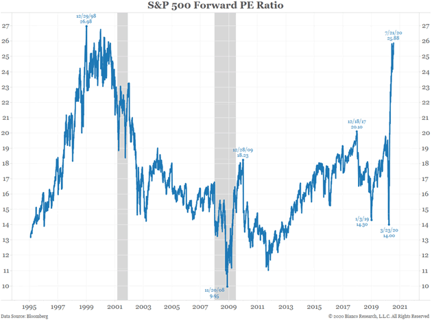
Chart: Bianco Research
From Jim:
The bulls cry foul… we know that the earnings over the next year are wrecked because of CV19/shutdowns. So, let’s invent a new metric, P/E ratio looking ahead two or three years.
This chart uses 3-year forward earnings estimates. That is, Jun 2022 to June 2023. You are still paying over 21 for these earnings. Not cheap!
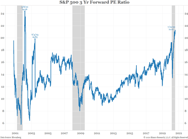
Chart: Bianco Research
Then Jim goes on to demonstrate that three-year forward earnings are generally very optimistic:
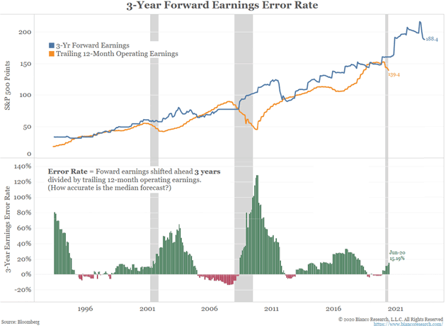
Chart: Bianco Research
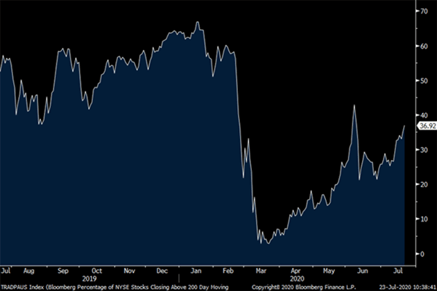
Where Is the Breadth?
In a true bull market, you see most stocks rising, often to new highs. A rising tide should lift nearly all boats. These next few charts from Peter Boockvar and Doug Kass will demonstrate that is not the case now.majority of stocks making
Let’s look at the percentage of NYSE stocks closing above their 200-day moving average, which is 37% now. It was near 70% in January.
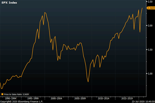
Another way to look at valuations is the ratio of price to sales rather than earnings. Here again, we have exceeded the 1999–2000 bubble.
The S&P 10 versus the S&P 490
Tony Sagami sent me a few charts from Twitter. It turns out that much of the S&P 500 returns come from just 10 companies: Microsoft, Apple, Amazon, Google, Facebook, Visa, Mastercard, Nvidia, Netflix, and Adobe. As a group they are up 35% since the beginning of the year. As a group, the other 490 are down more than 10%.
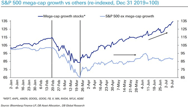
Chart via ZeroHedge
Like what you’re reading?
Get this free newsletter in your inbox every Saturday! Read our privacy policy here.
Europe has a similar phenomenon.
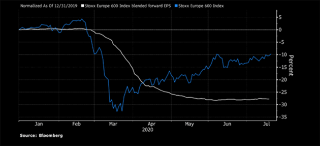
Chart: Bloomberg
If That Was a Bubble, What Is This?
Jesse Felder writes an amazing newsletter called The Felder Report. This is from his latest commentary.
Just three stocks make up more than 16% of the S&P 500 Index and over a third of the Nasdaq 100 Index. I bet you can guess which three. Apple, Amazon and Microsoft together are now valued at nearly $5 trillion. That’s larger than the entire economy of Germany and nearly the size of the Japanese economy.
What is really most astounding, though, is the aggregate valuation of these three behemoths relative to their free cash flow. Only at the peak of the Dotcom Mania did we see anything like it. The difference today is that these companies are growing free cash flow at a tiny fraction of the rate they grew it back then. If that was a bubble, then what is this?
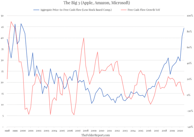
Chart: The Felder Report
About all you can say is “Wow.” These three stocks, larger than Germany, have separated from their free cash flow more than any time other than an outright bear market. If the concept of reversion to the mean holds, either their sales are getting ready to explode, or their stock prices are going to fall. Or some combination. These three stocks, in terms of free cash flow, are well more than three standard deviations above their average, and significantly more than even during the tech bubble.
We can’t talk about valuations without turning to old friend Ed Easterling of Crestmont Research. Where are we now and what are future returns likely to be? He takes us all the way back to 1900. [My comments in brackets.]
Crestmont P/E July 24, 2020: This is a basic chart of P/E. It includes the long-term average and a dot to update (and highlight) the current level of P/E in relation to history since 1900. Even though the market index is about the same level as it was at the start of the year, the CAPE P/E10 EPS (trailing 10-year real EPS) is up slightly over the past six months (mostly because recent EPS exceeds the periods at the start of the 10 years). [The only time this was exceeded was in the 1999–2000 dot-com bubble.]
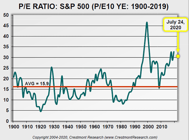
Chart: Crestmont Research
Crestmont P/E+ July 24, 2020: This is the basic chart of P/E with bands that reflect the typical starting and ending levels of P/E for secular stock market cycles. As reflected in the graph, we’re at levels that are well above the typical start of secular bears and well past the end of most secular bulls (except the tech bubble of 2000).
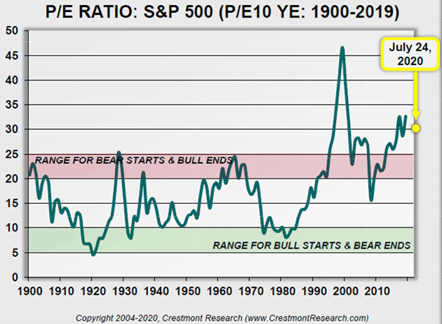
Chart: Crestmont Research
Crestmont OpsEPS P/E July 24, 2020: This is a Crestmont original. This chart provides P/E based upon forward, operating EPS. Wall Street bulls that want to make the market seem cheap often promote P/E in the most optimistic light. As you know, operating P/E is based upon a measure of earnings (for the denominator) that adds back a series of supposedly one-time charges to reported earnings (the EPS from which dividends are paid and capital is retained).
S&P has data for operating earnings back to 1988. Prior to that year, Crestmont built a series of comparable data using the historical relationship of operating earnings to reported earnings and a forward factor to reflect the typical relationship between forward earnings and trailing earnings.
Most often, the Wall Street bulls not only use a P/E based upon forward, operating earnings, they compare that value to the historical average for P/E based upon trailing, reported earnings. Yet, the difference in the averages is almost 4 points… 30%.
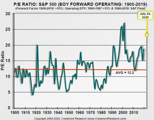
Chart: Crestmont Research
Crestmont Gazing July 24, 2020: This chart overlays stock market performance and valuation. The power of this chart is that it (1) demonstrates the strong effect that valuation has on future returns, and (2) provides a gaze at the future for likely returns over the next 10 years!
The line in the chart is valuation, as measured by P/E. The bars in the chart reflect the 10-year total return for the S&P 500 Index. The line is shifted forward 10 years so that the P/E aligned with each bar is the value for P/E at the start of the 10-year period.
Peaks in the line correspond to troughs in 10-year returns. Similarly, dips in the line correspond with peaks in 10-year returns. Valuation matters!
The rightmost bar on the chart is the period 2010–2019. P/E fell significantly in 2009, setting up the potential for great returns over the subsequent decade. The market delivered! Since then, P/E not only rose, it surged! The current level of P/E is very high, which portends a decade that will likely deliver low compounded returns.
The future bar under the end of the line (and dot marking July 2020) will reflect the cumulative compounded average return for 2020–2029. If history is a guide, and the principles of valuation remain true, a low single-digit percentage appears optimistic.
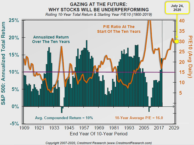
Chart: Crestmont Research
The next chart comes from Ned Davis Research via Steve Blumenthal. Notice that it shows the median price/earnings ratio is merely in the overvalued range, and nowhere near its all-time high. That means there’s still some historical room to run.
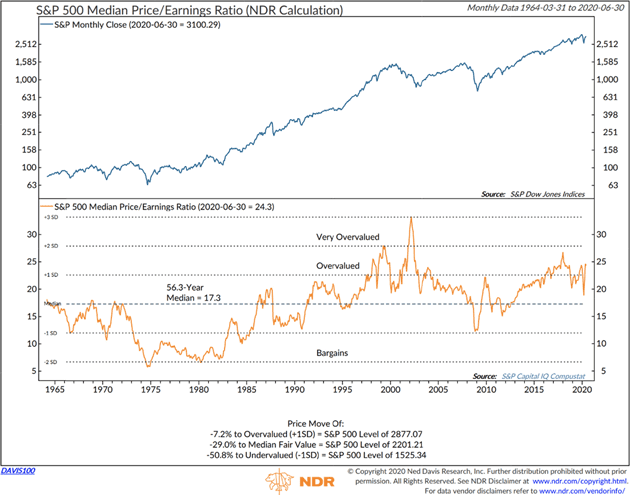
Chart: Ned Davis Research
Now let’s look at possible reasons why stocks are where they are today and why they could even go higher for longer than we might think. I think some of this shows a different perspective on the current mania. Little things add up.
Extra Cash
Back in March as the coronavirus spread in the US, organizations started cancelling large events. We didn’t know as much about the virus then but it was clear that crowds were hazardous. That includes sporting events.
On Wednesday, March 11, the National Basketball Association suspended its season after a player tested positive. But it was headed that direction anyway. Earlier the same day, the Golden State Warriors announced the team would play home games without fans present.
That was clearly the right move, health-wise, but it had a side effect no one considered at the time. Thousands of people who work for the teams and arenas, or in other related businesses, lost income. But sports gambling is a giant business in itself. The millions of people who wager billions of dollars suddenly had nothing to bet on. That proved important, for reasons we will see in a minute.
A few weeks later, Congress passed the bipartisan CARES Act which, among other things, gave most American adults a $1,200 one-time stimulus payment and added a $600 weekly federal payment to state unemployment benefits. This occurred as most of the country was in various levels of lockdown and many businesses closed. The payments were intended to help people through what we thought would be a short interruption.
All this happened very fast—so fast that it had to be simplified. Why not $500 or $700 for the unemployment benefit? I don’t know—but any number they chose would have been too little for some workers and more than enough for others.
As it turned out, the $600 from the federal government plus state benefits left many jobless workers making more than they did while working. This has helped. People are mostly making their rent and mortgage payments, for instance. Consumer spending held up better than expected, though its composition changed significantly.
Still, that left a lot of extra money in the hands of people accustomed to spending whatever they have. The lower-earning half of the population has little experience with saving or investing.
As noted above, sports betting was also unavailable. So where did all that money go?
Well, many of the recipients did what comes naturally: search online for advice. That led to data like this.
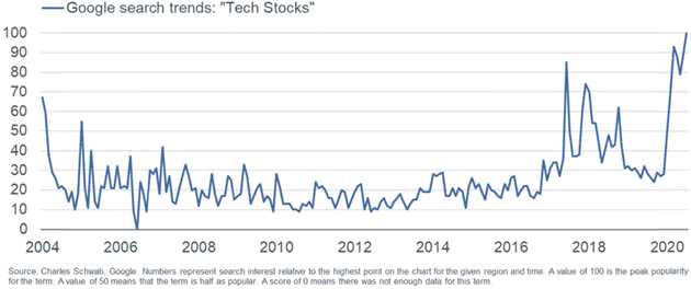
Source: Liz Ann Sonders
Of course, simply being interested in tech stocks, and having a few hundred or a few thousand extra dollars, only goes so far. You need some minimal amount of money just to open a brokerage account. Or at least, you used to.
Enter Robin Hood
Like what you’re reading?
Get this free newsletter in your inbox every Saturday! Read our privacy policy here.
Financial markets have been slowly “democratizing” for decades. In the 1960s, mutual funds gave the middle class a convenient way to own a diversified stock portfolio. Then came many more mutual funds, discount brokers, exchange-traded funds, and other innovations. All had the same effect: More people could invest more money in more kinds of markets.
Now we have a new stage in that process: commission-free stock trading, quickly accessible over the mobile device you already have, and in small amounts. Apps like Robinhood make investing simple and affordable. They do the same for day trading. But while they simplify the process, you still have to make the right decisions at the right time.
So now we have large numbers of small, inexperienced investors with spare cash from the government and an app in their pockets that looks a lot like a video game. And then there’s the sports connection, personified by now-famous blogger Dave Portnoy, who colorfully insists stocks can only go up and urges his large audience (which includes many idled sports bettors) to throw more money into the market. What could go wrong?
So far, not much. Portnoy has been largely right about stocks this year. His audience is fairly small but it’s big enough to matter. They are a subset of the red and pink areas in this personal income chart.
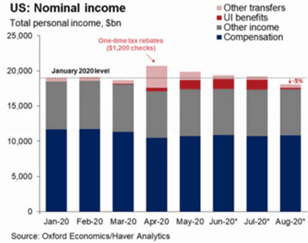
Chart: Gregory Daco
Recall, markets were very weak early in the corona crisis. February and March were volatile with several mini-crashes. But the benchmark indexes bottomed just as the CARES Act passed and the government began distributing stimulus cash in April. They’ve kept rising since then.
The payments to individuals were only the start. At the same time, we had the Federal Reserve pumping huge amounts into not just Treasury and agency securities but also various private assets, including corporate bonds. But the specifics of what they bought are not so important. The salient point is the cash they injected into markets, which found its way to other assets.
So, the current bull market is a kind of perfect cash flow storm. We have…
- Legions of new investors using stimulus money to buy whatever makes them feel good
- Bored gamblers looking for action, and
- Large institutions brimming with Fed liquidity
- plus traders of all sizes, small investors to monster hedge funds, chasing momentum—a perfect witches’ brew
… all in the context of ultra-low interest rates that make cash and fixed-income holdings unattractive. You could not have designed a better perfect storm in which to create a market mania, and that’s exactly what we have.
If this were all Fed-driven, we would still be seeing a bull market but it would be different. Institutional investors consider fundamental factors like valuation and earnings. They wouldn’t plunge a lot of money into small-cap cannabis stocks, for instance.
For the moment, the all-in strategy seems to be working better than the cautious one. Yet history shows fundamentals eventually matter, and many of today’s buyers probably won’t like what happens.
Here’s another chart from Doug Short and Jill Mislinski, calculated as of July 6, 2020.
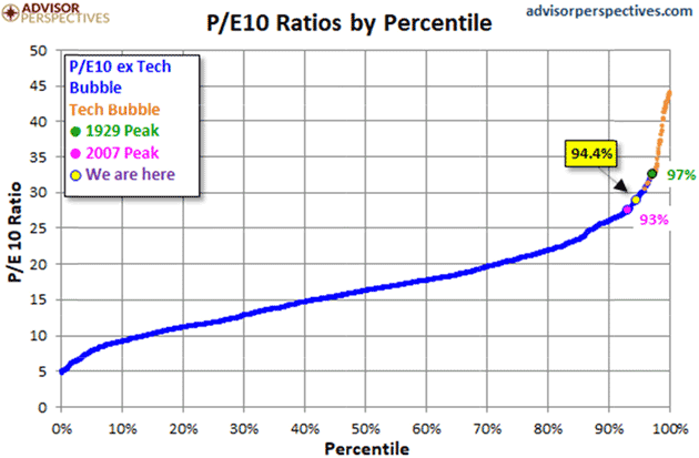
Source: Advisor Perspectives
We see here that the S&P 500 P/E10 is presently higher than it has been 94.4% of past periods. Stocks are in the zone (and not just in the zone, but high in it) where Easterling shows above-average returns are unlikely. It is above the 2007 peak and approaching the 1929 peak. The only higher points were during the 1990s Tech Bubble.
Now, think back to that Google search data I showed above. Interest in tech stocks is again extraordinarily high. History rarely repeats so nicely, but it sure looks like we may be in Tech Bubble II (plus Mastercard and Visa).
At the very least, now looks like a terrible time to buy stocks if your intent is to hold them a long time. If your intent is to buy high and hope to sell even higher, good luck to you. It might work. History also shows manias can persist much longer than most people think. Back in 1999, I and many others thought there was no way the bull market could go on. Yet it did, with the Nasdaq actually doubling in 1999.
Triggered Market
Overvalued markets don’t turn down on their own. Something usually triggers them. What could it be this time?
In the medical world, stimulants have legitimate uses but the dosage is critical. Too little and you don’t get the desired effect. Too much can cause great harm. And once you find the right dosage, suddenly stopping it can be dangerous.
Like what you’re reading?
Get this free newsletter in your inbox every Saturday! Read our privacy policy here.
As of this morning, the added unemployment is still set to expire at month-end. Negotiations are underway so maybe we’ll know more later this weekend or next week. But what happens when/if that stimulus goes away?
We should by now realize jobs are not going to come back to where they were a mere six months ago. We will still be in recession-level unemployment well into next year. The rest of the world is reeling. Those earnings projections that we looked at above? For the most part, they are going to be wildly wrong.
Eventually, earnings matter. Now, also eventually, we will get a vaccine or herd immunity. We will begin to come out from our isolation cells. But the world will look significantly different, and businesses, from the very smallest to the very largest, will have to adjust. That means earnings are going to have to adjust.
The world is getting ready to be repriced. Everything is going to seek a new value. Real estate, stocks, commodities, food, medical costs, college costs, government, entertainment, sporting events, clothes… Everything. Some price adjustments will be minor and some will be significant. I expect many to be deflationary, although some markets and items will see significant price increases.
“Inflation” in the general sense might be very difficult to calculate and even more difficult to understand. Your personal inflation rate will depend on what you buy. If you are trading the markets, I would tighten your stops. I firmly believe you’re going to have a much better and significantly lower entry point in the future.
Coping with COVID
I saw a cartoon the other day. Two guys in a boarded-up room, one saying, “Who knew there would be so much sitting around doing nothing after the apocalypse?”
I, for one, have plenty to do, but I hear complaints like that from friends and family. We’ve all had our routines upset, and are trying to decide whether to find new routines or just wait until we can go back to the old ones.
Personally? I think we will need to create new routines for our daily lives. They will blend past and future. Many people are leaving the inner cities and moving to the suburbs, driving home sales back up to pre-COVID levels. That also means urban apartments and condos will drop in price. That will be unpleasant for many.
My wife has a special friend named Eric Fulcrum. He and his wife visit us from time to time. He is a gifted body worker. He has his own combination of massage, kinesiology, yoga, and chiropractic. It can actually be quite painful, although it really helps. We have been working on my shoulder, where I tore my rotator cuff (for the third time) about a year ago. It really hasn’t released properly since then. He starts on my lower back and wrist, towards the shoulder, and then goes to the top of my head, through my neck and down. After just two days, my range of motion is significantly better. And I have four more nights of this. Now if I could just get into a gym…
You have a great week and I hope you’re enjoying a new routine. Stay safe out there!
Your needing to shake up his own routine analyst,

John Mauldin
P.S. If you like my letters, you'll love reading Over My Shoulder with serious economic analysis from my global network, at a surprisingly affordable price. Click here to learn more.
Tags
Suggested Reading...
|
|


Did someone forward this article to you?
Click here to get Thoughts from the Frontline in your inbox every Saturday.
