
Nose Blind to Inflation
-
 John Mauldin
- |
- January 24, 2020
- |
- Comments
- |
- View PDF
 John Mauldin
Hedonic Fantasies
Meaningless Averages
Desperate Ideas
Inflation May Not Be the Most Important Statistic
Philadelphia, Dallas, and New York
The human brain excels at taking shortcuts. Processing all the information our senses collect takes a lot of energy, so repetitive data gets lower priority. Things we see often fade into the background so we can notice new stuff.
This is where we get phenomena like “nose blindness.” We stop perceiving familiar smells like our pets, perfume, cigarettes, and even our own body odors. But others do smell them, which can get awkward.
I think something like that may explain why the Federal Reserve doesn’t see the inflation others notice. Their data says inflation isn’t a problem, so they ignore indications otherwise. We see this in their policy decisions. And it’s not just the Fed; other central banks, Wall Street analysts, economists, and politicians have the same affliction.
The kindest thing we could do is tell these people about their, ahem, unattractive condition. They might not react well, but at least we will have tried. So that is what I will do today. I’ll show how, the Fed’s lack of concern notwithstanding, inflation is a serious problem for many Americans.
In addition to Federal Reserve officials, most economists look at yet another set of inflation data and argue that inflation is too low. From their perspective they are right. But that doesn’t mean that you and I aren’t experiencing inflation in what we buy.
Furthermore, the way we measure inflation has been changed many times over the years. It may be time to do yet another adjustment to our inflation measures to better reflect the economic reality of the average American.
Hedonic Fantasies
Today I’m talking about price inflation, i.e., changing prices of the goods and services we all must buy.
Price is, as we learned in Econ 101, the intersection of supply and demand. Prices change when one of both those curves move, which they do for many reasons. Monetary policy is a big one but not the only one. Consumers and producers both have many constraints, such as wages and wage growth, disposable income on the one hand and cost of goods and actual demand for their products on the other hand. Somewhere in the middle they find balance, and that is where prices settle.
That’s the economic theory. In practice it is a lot messier since we have such a dazzling array of goods, services, people, and places. Not every market is equally efficient. Therein lies the problem: how to distill this complexity into one meaningful number?
Wonks tell us, with all sincerity, things like “the US cost of living rose 2.1% last year.” Really? To an actual numerical decimal place? On something as vague and as complex as inflation? Now, to give them credit, they are looking at the total national inflation rate and it is extraordinarily complex. They do the best they can.
But the inflation you and I experience? They don’t know that. They can’t know it, at least not with any precision because the cost of living is so individualized. Everyone spends their money differently, and the things they spend it on vary in price for many reasons.
That doesn’t stop the wonks from trying, of course, and it’s not entirely their fault. They work for policymakers who demand information. Whether it’s accurate information is less important than simply having something on which to hang their hats.
One of the most important economists of the last century was Kenneth Arrow. During World War II, he was tasked with predicting the weather on D-Day, when the Allies would attempt a beach landing in France. The weather would be critical.
Arrow told his commanding general there was an extraordinary amount of uncertainty for his prediction. The general answered, “We know that. But we need a number to work with. And you have to give us the number.” Talk about a no-pressure environment. Government statisticians, while maybe not feeling the same pressure, are also responsible for millions of lives since so much personal income is tied to that inflation number.
Note also, policymakers have preferences on what the number should be. Many government programs have inflation adjustments. Higher inflation forces politicians to make tough decisions about taxes, spending, and borrowing. These same politicians hire and pay the people who compile the inflation numbers. That’s what we would call in the investment world “a disclosable conflict of interest.”
Having said all that, I believe the analysts try to be fair and scientific. They have to work within boundaries that don’t always make sense. So we get crazy things like “hedonic adjustment.” That’s where they modify the price change because the product you buy today is of higher quality than the one they measured in the past.
Like what you're reading?
Get this free newsletter in your inbox every Saturday! Read our privacy policy here.
This is most evident in technology. The kind of computer I used back in the 1980s cost about $4,000. The one I have now, on which I do similar work (writing) was about $1,600. So, my computer costs dropped 40%. But no, today’s computer isn’t remotely comparable to my first one. It is easily a thousand times more powerful. So the price for that much computing power has dropped much more than 60%. It’s probably 99.9%.
Louis Gave surfaced another example. According to Consumer Price Index data, a television set that cost $1,000 in 1996 is now $22. You can’t buy any such product today, but the fact you can spend the same amount of money and get a better TV depresses the inflation rate.
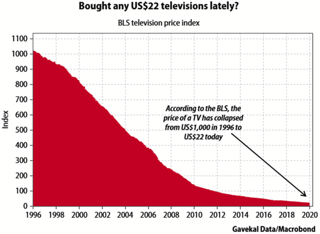
Source: Gavekal
They do the same thing for cars, as Peter Boockvar noted earlier this month.
Last week Edmonds.com said the average price of a new vehicle sold in 2019 was $37,183, a new record high and up 30% from where it was 10 years ago. Within today’s CPI, the price of a new car reflected a 2% increase in TOTAL since 2009. This is magically done via hedonic adjustments which discount the value of new add-ons with each subsequent iteration of cars.
Unfortunately the actual buyer of a car has to pay what the price is and that is why delinquency rates are rising (according to the NY Fed, loans 90 days late totaled 4.7% in Q3, the highest since 2011) and the average length of a loan is at a record high (Experian said in November that 7-year auto loans amount to 31.5% of new vehicle sales vs 10% in 2010). The average price of a car is about 60% of median income in the US and incentives in December were a record amount of $4,600 per vehicle on average according to JD Power.
The Fed relies on hedonically-adjusted data points and not the price that people are actually paying out of pocket.
Exactly. Hedonically-adjusted prices exist only in theory. They don’t reflect what people actually have a choice of spending.
Health insurance is another good example. CPI says it rose 20.4% in 2019. That’s a national average that could be much more depending on your age and location. But worse, is the policy you can buy now identical to the one available a year ago? Certainly not. It could have a higher deductible, narrower network, smaller drug formulary, and a wide variety of internal differences in coverage for various conditions, which you will never know unless you seek treatment.
The real price change is impossible to know. That 20.4% is a national average of local guesswork, bearing no connection to anyone’s reality.
It gets even more complicated. I quoted CPI above. The Federal Reserve actually prefers something called PCE, Personal Consumption Expenditures. The two indexes have different estimates of the appropriate basket. The CPI is based on a survey of what households are buying; the PCE is based on surveys of what businesses are selling. Social Security uses the CPI for adjustments. The Fed uses PCE when targeting inflation. PCE is generally lower, as we can see from the chart below.
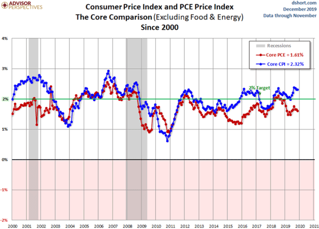
Source: Advisor Perspectives
Meaningless Averages
I mention cars and health insurance because they are two of the larger budget items for most households. And both are broader in reality. The car takes you nowhere unless you also buy fuel, insurance, and maintenance. Health insurance helps only after you pay your deductible and co-pays, which can be substantial.
But housing is the biggest single living cost for most people. Here again, the individual variation is so huge as to render national averages meaningless, even if they were accurate (and they’re not).
For instance, if you bought your home years ago with a fixed-rate mortgage, your personal housing inflation rate has been zero. Your monthly payment is the same as it was then. If you have a variable-rate mortgage you might even be paying less for the same house, depending on when you bought it, because your rate dropped.
But housing costs aren’t just mortgage payments because a house can be more than housing. If you’re lucky, it is also an investment that will give you a profit someday. Meanwhile, you get to use it as your home and avoid paying rent. CPI recognizes this. Its housing component is a combination of average rental rates and something called “owner’s equivalent rent (OER).” That’s the amount you would expect someone else to pay if you rented your home to them. You are, in effect, “paying” it to yourself.
According to the December 2019 CPI report, “rent of primary residence” rose 3.7% last year and “owner’s equivalent rent” rose 3.3%. Those two combined are about 33% of CPI. Do they reflect reality in any significant way?
Maybe. It depends on the kind of housing you need and where you need it. According to Apartment List, the national average increase in apartment rent was 1.4% last year. But it was considerably more in some places. Mesa, Arizona (Phoenix area) tops their ranking at 5.1%.
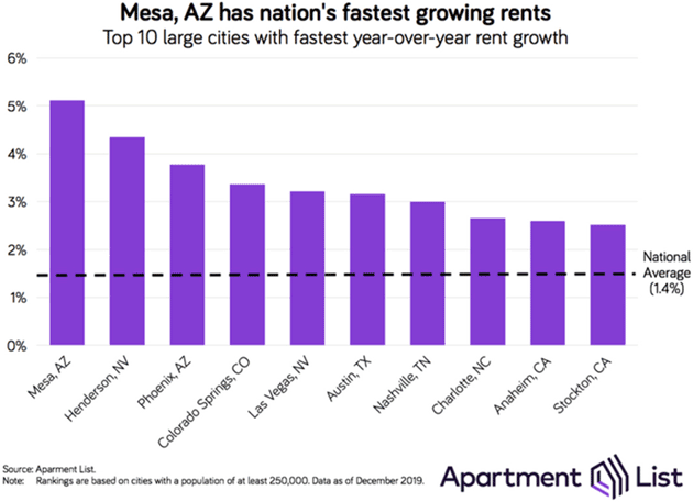
Source: Apartment List
Those are apartments. House rental rates are something else completely, as are home and condominium purchase prices. As noted above, your home’s resale price has no impact on inflation unless you actually sell it, and even then it doesn’t show up in the inflation measure. But home values can give us a rough approximation.
CoreLogic data shows something interesting.
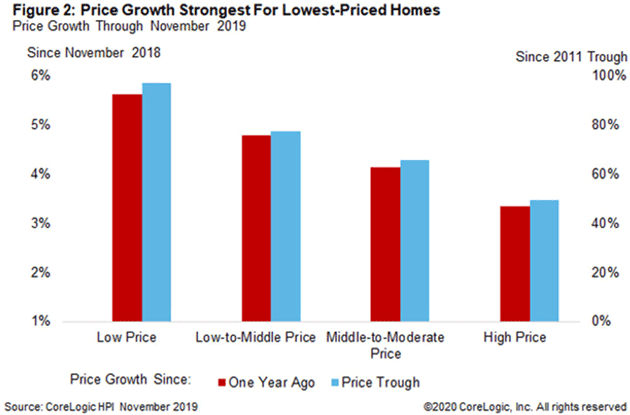
Source: CoreLogic
Price changes in the last year were highest at the low-priced end, up 5.6%., compared to 3.4% in the highest tier. But according to BLS, national average owner’s equivalent rent for homes of all prices rose only 3.3%. So that doesn’t fit and again, the national variation is dramatic. CoreLogic’s home price index rose 10.2% in Idaho and actually fell slightly in Connecticut.
Like what you're reading?
Get this free newsletter in your inbox every Saturday! Read our privacy policy here.
Now, you might say the difference between 3.3% and 5.6% isn’t so dramatic. Remember, we are talking about a full third of the budget for most families. So if CPI has been understating housing costs by as much as it (hedonically) understates vehicle prices, it’s enough to make a difference—a dramatic difference if compounded over time. And especially if you are on Social Security or other inflation-adjusted income.
Desperate Ideas
The agencies don’t simply adjust their inflation measures on a whim. They have reasons, most of which make sense, but they add up to a number that doesn’t reflect actual experience. This causes policy errors and greater problems.
We have other, non-government inflation figures. One is the venerable ShadowStats, which adjusts the published CPI numbers using the methodologies the government itself used in 1990. That adjustment has its own limitations, but might be closer to the reality you experience.
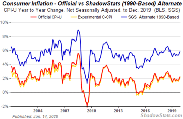
Source: ShadowStats
Recently, the CPI under the old methodology has been running about four percentage points annually above the official numbers.
Another alternative measure is the Chapwood Index. Twice a year, Chapwood checks the price for 500 common consumer items (see list) in the 50 largest cities. As of mid-2019, the five-year average annual cost-of-living change in those cities ranged from 6.6% to 13.1% (in Oakland, CA, if you’re wondering).
That’s more dramatic and possibly overstated, even if you chop Chapwood’s numbers in half. And remember, they measure retail prices. If you measured wholesale items that businesses purchase, you might even see deflation.
Now, the people who sit on the Federal Open Market Committee aren’t foolish. They are aware of data limitations. So why do they persist in thinking inflation is under control or (shudder) look for ways to generate more of it?
To answer, I’ll summarize a very complex argument among economists. Forgive me if I oversimplify it.
Essentially, if you used ShadowStats or any other statistic showing higher inflation, you have to assert that GDP has been shrinking for 30 years. That is clearly not the case. The US economy has grown, albeit slower in the last 10 years, but we are certainly not in a constant negative 2% per year recession. Looking at actual nominal GDP (yet another imprecise measure), we are clearly growing.
Again, this can be very misleading to any individual. Your personal GDP may be either growing or shrinking. A lot depends on how your business is doing if you are a business owner, your salary or wages, etc. National GDP is the theoretical (and let me emphasize the word theoretical) total production of 330 million people.
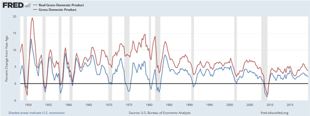
Source: FRED
So, when economists say inflation measures are too high they are making a macroeconomic argument from top-down data. Others who argue inflation is significantly understated rely on bottoms-up data.
Both sides are arguing a particular point of view, using data to buttress their viewpoint. A man hears what he wants to hear and disregards the rest. I understand both arguments and they both make extraordinarily valid points, but for those of us living in the real world, are hard to swallow.
Nominal average weekly earnings for all employees rose 28% in the last 10 years. If we can believe that data, the average worker has roughly kept up with average inflation, if average inflation accurately reflects the cost of living. For many people it clearly hasn’t. So the average worker has probably fallen behind. How much?
It depends on what you buy. Seriously.
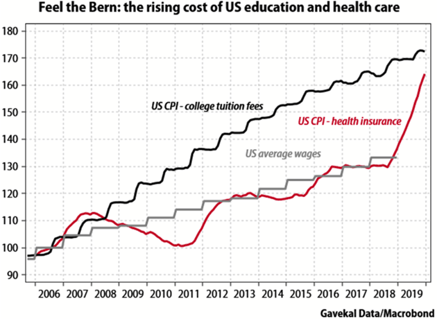
Source: Gavekal
We started out talking about nose blindness. Most people don’t keep careful track of their spending and income. They don’t know their wages rose x% and spending rose y% in the last decade. They just know making ends meet is tough and getting tougher.
So if both the public and the Fed are nose blind to inflation, where does it take us? Nowhere good. But we’re going there fast.
Inflation May Not Be the Most Important Statistic
Like what you're reading?
Get this free newsletter in your inbox every Saturday! Read our privacy policy here.
I believe the pressure on the average American can’t be expressed in wages or inflation. For most people, disposable income is where they live and breathe. Fixed costs, whatever yours are, eat into disposable income. That’s what we feel.
The yellow vest protests in France arose from a rather small increase in the (subsidized) diesel fuel price. Similar fuel-price protests recently swept Iran. Chile has had major riots in protest over public transportation costs rising a few pennies. Similar situations have occurred elsewhere.
Relatively small price increases for an item or two can be the straw that breaks the camel’s back. When disposable income is so tight that even a few pennies mean the difference between food for your children, or not, anger can explode into riots. The actual prices at stake may not be significant except they act as “the straw.”
I have serious concerns about how we measure GDP. We double count some items, not the least of which is government expenditures, making the economy seem bigger than it actually is. What we call inflation is an imprecise measure of an artificially created government statistic. When we measure “real GDP” we are using that imprecise measure on yet another imprecise measure of artificial government statistics called nominal GDP.
The irony is that we think we can measure GDP or inflation out to two decimal points. I have always contended anything to the right of the decimal point is simply economists trying to demonstrate they have a sense of humor. Like a weather forecast for D-Day, we need a number. But we should recognize the limitations.
Furthermore, remember that these measures are for 330 million people in an extraordinarily chaotic and complex society. We count some items and ignore others. Or we apply adjustments which aren’t real-world. As they say, your mileage may vary.
This is yet another reason the Fed shouldn’t be allowed to control short-term rates except in the most extreme circumstances, and then only to provide liquidity. The use of artificial measures to set the price of the most important commodity in the world (the interest rate of the US dollar) of necessity leads to imbalance and occasional crises. A low-interest-rate environment misallocates capital into financial transactions which are not necessarily productive. While it may make money for some people, it doesn’t add to the general well-being.
And that is not going to change. Those of us responsible for allocation of capital for clients and ourselves have to recognize reality and invest accordingly. All the while knowing that imbalances are increasing and we will eventually face a reckoning. Sigh…
Philadelphia, Dallas, and New York
I find myself in Philadelphia for a last-minute but worthwhile trip. I fly back Friday evening to Puerto Rico. I will now have to be in Dallas in two weeks and Shane wants to come with me. And I still have to get to New York at some point. And write my book and help plan a conference and, and, and…
The conference this year is going to be the best ever. The names we are lining up are impressive. Set your calendar for May 11–14 to be in Scottsdale, Arizona. We are limiting the number of attendees this year, so when you get the opportunity to register, I suggest acting quickly. That will likely happen in the next few weeks.
And with that I will hit the send button. You have a great week!
Your laughing at “statistics” analyst,

John Mauldin
P.S. If you like my letters, you'll love reading Over My Shoulder with serious economic analysis from my global network, at a surprisingly affordable price. Click here to learn more.
Put Mauldin Economics to work in your portfolio. Your financial journey is unique, and so are your needs. That's why we suggest the following options to suit your preferences:
-
John’s curated thoughts: John Mauldin and editor Patrick Watson share the best research notes and reports of the week, along with a summary of key takeaways. In a world awash with information, John and Patrick help you find the most important insights of the week, from our network of economists and analysts. Read by over 7,500 members. See the full details here.
-
Income investing: Grow your income portfolio with our dividend investing research service, Yield Shark. Dividend analyst Kelly Green guides readers to income investments with clear suggestions and a portfolio of steady dividend payers. Click here to learn more about Yield Shark.
-
Invest in longevity: Transformative Age delivers proven ways to extend your healthy lifespan, and helps you invest in the world’s most cutting-edge health and biotech companies. See more here.
-
Macro investing: Our flagship investment research service is led by Mauldin Economics partner Ed D’Agostino. His thematic approach to investing gives you a portfolio that will benefit from the economy’s most exciting trends—before they are well known. Go here to learn more about Macro Advantage.
Read important disclosures here.
YOUR USE OF THESE MATERIALS IS SUBJECT TO THE TERMS OF THESE DISCLOSURES.
Tags
Did someone forward this article to you?
Click here to get Thoughts from the Frontline in your inbox every Saturday.